Saturday, October 17, 2009

projects for the new economy


What sort of jobs are coming now? Here's a typical cross section of what I'm doing. The first is for a developer who was selling improved lots to Ryan Homes. Ryan is unusual for a large public company in that the never improve their own lots. They contract them fully improved with a take down schedule, usually at the highest price the market will bear. They then sell the homes on contract, typically not taking down the lot until after the house has been sold. Not the most profitable way to do business, but a great way to minimize risk and afford a huge return on investment. There's no money tied up in inventory. It's all great except when the market turns and the developer who was counting on Ryan's huge price for the lot is left holding the bag, with no one interested in paying anywhere close to Ryan's price. All you can do is build it out and hope for the best. Here's a 20' townhouse project where Ryan's product was selling for mid $200,000. The market tells us to move product, we have to be at $175,000. for something with the same appeal. Here's what we have. Every possible cent was taken out of these, while making them still appealing to the marketplace.

Here's another one. I mentioned earlier a luxury condo project selling in the 1.5 million dollar range. We thought about reducing the square footage and the price about 20%, and a plan was posted a couple months ago. Now this has been re-thought. We got the first floor even smaller and hope for a price well under a million. Time will tell. The photo is of the existing model home- over 4400 s.f.


Another developer, again with lots left over from a cancelled Ryan deal has to make a project of 22' two story townhouses, and 24' three story townhouses. Our strategy here was to introduce a look to differentiate our project from the competitors, and offer some unique plans to try to get a premium for the community. Easy to strategize-but hard to accomplish. Here's our first stab at the look for the community.


For a note of nostalgia, I was out a couple of weeks ago and snapped some photos of a couple of the last houses being finished up more reflective of times gone by. What I'm starting to call the good old days. The one on the left, the first one started, was sold for full asking price before it reached drywall stage. The middle one sat for over a year 3/4 finished, was sold by the builder as is with a substantial discount, the buyer putting the completion contract out to bid. The original builder didn't win the contract. The third house sat empty for a while, but now the builder has finished it up and moved into it himself.

Thursday, August 27, 2009

32' cape plan


I was looking at one of Greg LaVerda's new plans over on the CORA site, and was inspired to post this plan here.He starts with a 32x32 cape layout, but presents it in what he calls a MoTrad idiom. You can see the traditional roots, but a variety of very modern gestures quickly removes most traces of a traditional plan. He calls it a stealth house. Perfect for sneaking in to a traditional setting.

This is a 32x36 cape cod which was designed to sell for about $200.k on a $55k. lot. Builder's cost to build was about $110,000. Obviously, cost was paramount. The w/d was sent down to the basement. The first floor bath is shared with the bedroom. The kitchen layout is basic- with no island (to allow for an old-fashioned kitchen table). At this price point, I'm competing with 20' wide 3 story attached product. Room count and sizes correspond to this competition. My big selling points are the 2 volume ceiling areas. 3 dormers light the front area, while skylites illuminate the open ceiling in the family area. You give up the garage. I typically detail my dormers with the fypon face kit, but this builder deleted that and let his siding mechanic take care of it. Oh well. House was sold last year soon after completion and the builder is putting a second version next door. This time, the 3 front dormers are deleted, a cross gable with a window is put in, and the front room is floored with access from each of the bedrooms. Now for sale at $219,000.

Wednesday, July 29, 2009

shack attack


An honestly designed house. A home which doesn't try to be anything more than what it is. No effort to feed the owner's ego. No effort to bloat up to impress friends or neighbors. Just an honest little structure to house ourselves and our families. With just enough stylistic content to reflect ourselves and our values, while maintaining a connection to our culture's history of the built environment. Not too much to ask is it? It is a house type which has a continuing appeal. It's been called a bungalow, a cottage, a cabin, maybe a lodge. I'm going real down and dirty here though, and taking the concept all the way to "shack." Simple forms, natural materials, porches, and informal lifestyle. No pretense whatsoever. No country club memberships or Range Rovers need apply. Just bring your kids and dogs and enjoy yourselves for heaven's sake.

I've settled on 2400 to 2800 s.f. with 1- 1st floor bedroom and bath, with the master upstairs. Garages are optional- detached - and placed on the back of the lot. The street scape is unassuming, unimpressive, but quite comfortable. Who wants one?

Tuesday, July 14, 2009

where did all the small houses go?


After gearing myself up for a run of 1500 to 2500 sf plans, seems like all I'm working on is larger homes. Here's what has gone out in the last month. The first is a 3800 s.f. plan in a Med. style. No living room or study, just a family room and a 1st floor "man" room with a walk behind bar.

The second house is a larger estate- approx. 6-7000 s.f. The front was rendered with a hip roof, the rear with a gable roof. We seem to be settling on the gable. What's interesting to me about this plan is the way there are 3 distinct circulation zones on the 1st floor. The foyer runs front to back with a staircase under a window dislay at the rear. a half flight down takes you to pool deck level. From here, you enter an area I call the grotto, a stone walled room containing a back staircase with a cozy sitting area underneath. This is centered on the opening to a barrel vaulted kitchen. The third circulation zone is conceived as a gallery, with art displays and openings to the great room, family studio, and back entry. We got rid of the two story volume in this plan, but there's still a great variety in the feel of the spaces as you move through the plan. Are we green yet? Geo thermal seems to be popular with clients deciding the extra expense is worth it if its less than a 8 year payback. I also note that the 2 story Great room was not desired in either of these plans.

Friday, June 19, 2009


Interesting commission came in a couple weeks ago. A group of investors have to take over a project from a builder who evaporated. They are in to the lots for way too much money. The only way out maximizing value is to hire one of the many laid off production builder project managers and have him build houses for as low cost as possible to create the kind of compelling value which will make a sale. They'll pay all the costs, and whatever is left at the end of the day is what they recouped from the lot.

Market told us we had to sell at about $135. per foot, and the area dictated 300-400k sales price. So that meant 2100-2800 s.f. You are probably thinking I might introduce one of the new plans I've been posting here, but I didn't think they would work well in this instance. Back to the tried and true. Several reasons: First, a non-existent builder. This is not an actual company, its a group of investors who can hardly agree on when to have a meeting, let alone new kinds of product design. Second, the site is on the fringes of our marketplace, not the sort of setting state of the art buyers might consider. Third, These things will be built by production subs probably traveling a long way to get there. They have to be simple. I've shown a couple of samples. Nothing too revolutionary, but I'm trying to get rid of the big foyer window, and introduce a couple of ideas not usually seen in this price range: the open staircase to the basement on the one plan with the wide opening to the family area in the back of the house. The other plan would typically have an open foyer with a T-stair, but here we closed it off, made a straight run on the stair, and used the space for an upstairs laundry and nicer bath. Small gestures, but may help this product stand out from the Pulte type competition.

Monday, May 25, 2009

voysey hollymount


Here are two plans which seem to be in the same general theme as those recently posted. The first is a 56' wide version of C.F.A. Voysey's Hollymount. This plan is done as a 3600 s.f. version, with the usual room components. In Keeping with the English Arts and Crafts roots- the garage is planned to be detached. Look what happens to the plan when it is adapted to the new economy. It loses 14', down to 40' width. The study morphs into a desk alcove. The dining area is expanded and opened in to the kitchen. The formal living room is made so it could be closed off as a playroom or study. The main living space is opened up to the kitchen area. We shed 14' of width and over 900 s.f. of avoir du pois.

playroom and study


One of the thoughts coming out of this new examination is the fact that given the requirement of giving up 10% in the expected square footage, many people are more willing to give up convention notions of public- private or formal-informal divisions in the house. Rather than devoting space to both formal and informal dining rooms, and formal/ informal living spaces, they prefer just one space devoted to each of these functions. With the single living space devoted to a huge TV and enough room to play the Wi, there remains a need for a more secluded study- and those with young children need a playroom to keep the kid's toys and games out of site during parents hour. We haven't really reduced our room count, but the spaces are more devoted to the way most of us lead our lives. The key to this is getting the typical nook space large enough for a 6 person table so the formal dining room can be bagged. In this way the dining room can become the playroom (close to the kitchen) while the formal living room can be closed off as a study. Here is a classic center hall layout adapted to these purposes.

This plan is for a new model for a community which was planned 3-4 years ago. Problems with the site improvements delayed construction until a lawsuit and some engineering issues could be worked out. The model home is just now nearing completion, but it was thought that perhaps the size is a bit too big. The homes are selling for 1.2 to 1.4 million, The goal, get something to start at perhaps 999,990.- Using my 10% and simplification formula, the following plan was proposed.

Previously, the smallest 1st floor was 3100 s.f.- this one clocks in at a tad over 2700. A high water table dictated slab on grade construction- very unusual in our area- but ample attic storage and radiant floor heat provide adequate compensation for the loss. The developers want to give a little more time to see if the initial price points will be valid, but this layout is waiting in the wings.

luxury retirement community

plans for the new economy


Many of us are trying to second guess what the buyers will be seeking when they return. That was the original premise for this blog. As a reminder, I'll start by posting up again the result of this inquiry from last January, an approx. 2500 s.f. plan, designed to compete with 2800 s.f. builder box ( a 10% reduction), designed on 4 sides, with a totally planned interaction with its site, and efficient use of construction methods and materials. I might add to this, a massing aesthetic simplified a bit from previous norms, with detailing perhaps a bit more elaborate. Besides this original blog plan, I'll add in some of the other stuff crossing my desk in the past 6 months in additional posts

Saturday, May 2, 2009

split plan


This is the plan that wouldn't upload yesterday

Friday, May 1, 2009

other plan concepts for the new economy

Part of what I've been working on the past couple of months are plans which might fit the sorts of ideas that buyers are likely to respond positively towards as the pursestrings loosen in the coming months. Being an old and in the way sort of guy, I of course am going back into the archives to see what made sense back in the old days when every construction penny was counted. Split levels and bi-levels. These housing types got rid of the basement, at least partially, and made use of all the volume created in the house construction. 4/12 roof slopes made the plans look a little dinky, but prevented not only the expense of building large roof volumes, but also the design burden of figuring out how to get up there, and how to use the new found space. These housing types have held on to a stigma in today's marketplace, and seldom sell at favorable price per s.f. rates compared to a traditional 2- story.

My thought is that if the roof pitch is increased to a more compelling 9 or 10 in 12, and the attic space is made accessible and useful, the construction economies can be enjoyed without compromising the price per s.f.

I took a plan I built back in the 80's as a contemporary- vertical cedar siding, clerestory windows- etc. and put on a more traditional steep roofed exterior. The cost per s.f. to build this should be advantageous, and the plan has a lot to offer. The image doesn't want to load right now, but I'll put it up on the next post.

Friday, February 27, 2009

blog plan update


So, there's good news and bad news. When I floated the plan that started this blog out to one of my builders, along with 6-7 other likely candidates, the realtor came back liking this one the most. But with a few modifications. take the garage off the back- move it to the side wall along the kitchen side, and reverse the plan. Of course, that defeated the purpose of the original parti, but, not being too busy, it also allowed me to develop the idea Chris raised earlier about placing the kitchen closer to the living space. I kept the garage as rear as possible to allow a side window in the dining room, and rearranged the master suite as required by the new massing. This is being marketed as a paper listing on one of the builder's vacant lots, so we'll see if there is any buyer interest, and if so, which version they prefer.

Thursday, February 19, 2009

a 2500 s.f. plan from 1983

Going back and mining some of the older plans I built, I remembered this gem. It was done for a professional couple without children. They wanted a house in a "no particular style" style, but which had a sort of timeless elegance to it. They didn't want it to look dated in 20 years. I always think about this one as the dryvit house. Back then, it was not used much in residential, In fact, there were only a couple of commercial projects with it in our area. My advice back then was not to install it over plywood or OSB sheathing. I used 2'x8' sheets of gyplap. The foam was 2" thick- supplied by the Dryvit people, to be sure it was cured properly. Never had any problems with it. I seem to recall a sprayed on insulation in the walls as well rather than batts, but I'm not sure. The plan was interesting because the clients wanted formal living and dining spaces , with a den for TV watching close to the bedroom. The kitchen was to be a hearth room feel. The floor of the library was framed with roughsawn oak timbers with an oak plwood layed under the subfloor above, so the ceiling in the foyer was all exposed framing. I haven't been back in this house in 25 years, but I wonder how that has weathered over time. Same owner still lives there, but the husband has passed away. 2500 s.f.- value is in the same $400,000. ball park of the other older homes. Maybe a little bit more like $500,000. with the all natural materials. Finishes inside were a little nicer as well. Rutt cherry cabinets and corian tops. My contract in '83 was $125,000. on a $35,000. lot.

Saturday, February 14, 2009

60' barn plan


Interesting to compare the last home- designed 27 years ago, with this project which was not built. I see now that I was mining the same themes, but in a totally different context. Take a look at the similarity in room layouts. At least it shows consistency.

From Jacobson's modernism, here I was playing with the idea of a Pa. bank barn, a vernacular form admired by many modernist architects- most notably Mies. maybe that's the Jacobson connection. This plan- not quite as long- but a little deeper, accomplishes the same goals in about the same size and cost. Looking back- I see I did this plan in Feb. 2002, 7 years ago. It was for an article titled "A Lesser Advantage"- playing with Mies's "less is more" truism. Back then I was barking up the same tree- $400,000 on a $100,000. lot

Friday, February 13, 2009

another 25 year old -2500 s.f.


I had a client back in 1983 who was all about Hugh Newell Jacobson. His houses were published in a couple of the trade magazines back then, but the monograph had not yet been published. We took some of his ideas and applied them to a very simple linear form. The budget was miniscule, and the detailing had to be worked out as we went along. Floors were all oiled slate, cherry cabinets, white corian tops, Hewi harware, Kroin faucets, Kawneer doors, iron pipe railings. As it was built, the stair tower was made semicircular with a flat roof and a skylite rather than the reverse gable shown. Front faced North, so minimal windows on that facade- the doors were recessed for shade on the South. The lot sloped so a long thin plan was desirable-as we didn't want a walkout condition to interfere with the purity of our side el.

Not a great house for kids, but it still works well for an empty nester or DINK client. I tried to photograph this for the blog, but its had a major addition, and trees etc prevented a view of even a part of the front. At the time it was built, the lot cost was $25,000. and my contract was $175,000. for the house and garage with a 5k allowance for well and septic. It transfered a number of years ago for $660,000.- but as a much larger house- so its hard to guess about the economics. Long thin plans are not the most efficient use of envelope, but they work well if the lot slopes. They also allow 12/12 roof pitches with standard length lumber. Now that our daughter is off in college, my wife and I could live in this plan very easily. On a 100k lot, we could get into it for about $400.k

Friday, February 6, 2009


I did this plan for Gary Campbell of Campbell landscape design. (www.campbelllandscape.com) The idea was to place the house to maximize what the lot would give us, and to afford as much flexibility in use as possible as needs change over the years. There are 3 private rooms, one on each level, and a large public space on the main level. A sunroom on the main floor is thrown in for good measure. The main bedroom at least initially is on the upper floor, but can easily be moved to the main level in the future- which space is to initially be used as a study/home office. The lower level is a guest room and Gary's office. The front of the house faces South, but the lot sloped down to the North with a great view. A stand of trees protects the front view of the house from the street. These conditions drove the placement of the garage as a buffer for the South facing yard from the entry sequence. The driveway evolves into a private path leading to the front door- or around the garage back to a nicely developed garden area. I think there are some photos of this on Gary's web site. The back yard is developed as a meadow- Gary's specialty. The trick in the mass development in the plan is that each functional zone is treated to its own roof form. All in all though it has a sort of traditional bungalow aesthetic. One of my favorite homes I've done in the past 10-15 years. Gary had it built by one of the more established local contractors and deviled them the whole time to achieve his goals of sustainable building practices. (separating trash-using only components with the desired chemical properties, etc.)

Because the size is similar to the last house- zillow appraised them almost identically- $348,000. Gary's lot is 5 acres, and the home is much newer. In time I'm sure it will gain momentum in value over the previous example

Thursday, February 5, 2009

Other 2500 s.f. plans


It is almost too obvious to mention, but of course other folks have put to task the question of designing a nice 2500 s.f. house. I've done it numerous times for a variety of clients. I thought it might be fun to post here some of the stuff I've done in the past. I built this one back in 1982. (just took the photo today) It was done as a spec house in the days when mortgages hovered at 14-15 percent. You had to watch every penny that went into the house, and pray that some transferee or other motivated buyer would come along and take it, letting you make a little bit of money before the bank got it all (sound familiar?)

So this was going on a 1 acre lot with onsite well and septic. All the other available specs were going on public water and sewer lots back in those days about 90' wide, so I wanted to do something that would play up the size of my lot, and a view off to the front right (as you face the house). The usable wrap around porch was the hook, and the plan was designed to pick up on a sort of homey cottage aesthetic that the wrapped porch would compliment. Other ideas in the plan, which were not common at that time, were the volume ceiling in the family room, a back staircase only, making the entry area large enough to move around in, a living room which could be closed off to use as a private study or a 1st floor bedroom, and a full 1st floor bath. Ceiling hts were 8' and 8'. The biggest problem for today's buyer is the simple master bath and single closet- but otherwise, it compares ok with today's product.

It was sold before I put the foundation in the ground. That wrap around porch was a killer. It was done the old time way with mahogany 1x4 T&G boards on a framed floor. The windows were T.D.L. mill windows site painted. I seem to recall using wood shutters on this as well. I have to take the blame for the dormer detailing and the flush rake boards ( I was using a painted crown mldg on my specs at that time) but that was my money going up there, not the buyer's. I think I sold it for $90,000. plus the lot, which was $20,000. Add another $5000. for well and septic. The buyer was in it for $115,000. I went onto zillow and saw it transfered in 1999 for $220,000. They had it at $346,000. at todays market value. (Zillow is a little conservative, but I think actually pretty realistic when it comes to stating a price at which something will actually sell.) That works out to 4% appreciation per year over the 27 year life of the house- Average for our area.

I'm still liking a lot of what I see in this plan. I wonder if today's buyer would. I think you'd be hard pressed to come up with a nicer home in this area at that price point.

I'll post up another one tomorrow. This one built about 10 years ago.- a custom design for an astute buyer who wanted something flexible and sustainable.

Wednesday, February 4, 2009


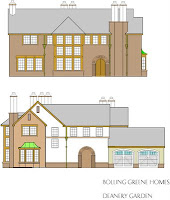
As promised, here are the plans and elevations for the deanery garden knock off I did a couple years ago for Builder/Architect magazine. The rendering is posted over on the CORA facebook photo page. It's about 3500 s.f. in this form. I see the els are for a 2 car, while the plan is for a 3 car. I think I doctored it for a proposed spec house 5-6 years ago. Fell thru, so I'm still looking for a client for this one. It's one of my favorite plans. I love the way the main circulation axis relates to the variety of cross axes. The outside-Inside-Outside-inside Entry sequence on the front door axis- and the look over 2nd floor library- first discovered by a glimpse through the great room at the front door, and later experienced again after climbing the stairs and exploring the upper cross axis. The semi enclosed courtyard- the rhythm of chimney stacks- the wood detailing around the great room window array. I don't know, this one just works for me.

Thursday, January 22, 2009

site plan update

Here are the site plan and interior els I was working on last week. At this point, I'm pretty much finished with this plan, other than trying to find someone to build it. I'll be using this blog to post other layouts which generally seem to fall into the same sort of criteria I used here. 4 sided design, and a plan which attempts to use all of its site- invites people to explore all the site has to offer. I've been talking with Christopher about Lutyens and posted a rendering of a take on Deanery Garden on the CORA facebook site. I did this for an article that got carried in the Builder/Architect magazine a couple of years ago. I'll post up the graphic used for the article here next time.


Wednesday, January 14, 2009

It's been a week

I've not been idle. I worked out my fireplace-Tv elevation and am quite pleased. I have given up on a wall mounted solution. Everything fights with the majesty of the fireplace. Brookstone makes a console with a lifting mechanism, and for me, that is the way to go. I just don't want to see the stinkin' TV all the time in my single living space. I post up the sketch later.

I've also been working on my site plan. The space just outside the kitchen has become my barbeque area- defined by a bit of low wall. The back yard is planned for a future 24x24 workshop in the back corner behind the drive. A small potting shed defines the other back corner. The Patio off the living space has an organic shape- there's a pond with a little stream
running alongside a path in the side yard. The front is reserved for BMP water recharge areas, and the center part of the back yard contains a 40x50' croquet court (minimum suggested size)
again- I'll post photos of the sketches next time.

Actually, doing this little project has reinforced these themes in my current work. 4 sided design, using nothing but natural materials in a way reflecting the assembly of mass. Allowing the house plan to interact with all parts of the lot. I've gone back to my archives and dragged out a couple of other efforts from the past which can be adapted to these tenets. I'm not going to insist on the rear garage. I understand that a front entry garage has its time and place. I'll post up some of these results next time.

Tuesday, January 6, 2009

recent thinking

I've enjoyed the feedback from the 2 Chris's and David. Seems like there's a couple of issues for further pondering, not only in this plan, but in general.

1st has to do with the degree of engagement from the kitchen to the living space. We all know that current practice is to thrust the one upon the other. 50 years ago, these were kept separate. Open planning has been adopted whole -heartedly by the builders, not only because the buyers ask for it, but also because it makes the respective spaces feel larger and thus more valuable. The kitchen has become the living room. Cabinets are now crafted from the finest cherry like the living room furniture used to be. Tops are granite. Our homes hemorrhage money in the kitchen like it grows on trees. The hobby of eating has supersized America to an alarming degree. Its apparent that my preference is to turn the kitchen back into a work space and recapture the living room as the primary activity area. Lets stop hanging around the island eating salty snacks and sucking down adult beverages. I know that my wife is never comfortable having the kitchen so exposed. She wants her own domain, away from the peanut gallery, where mistakes can easily be hidden, and messes can exist without disrupting the entire household. She can't be alone in this ( I don't cook, I just show up when I'm called and clean up after)

2) I've been working for a while to be sure my main living spaces can comfortably house both fireplace and TV without resorting to putting one above the other. Usually I do 2 focus walls with an L shaped seating arrangement opposite. I'm not wild about corner fireplaces generally speaking. This plan places the fireplace and TV side by side, which is usually not as successful. I've been working on developing elevations of this long wall to be sure I'm happy with it. I'll post these later on. Love to hear other thoughts on this issue.

3) I'm quite comfortable with long narrow rooms as a main living area, but I suspect others are not. The bowling alley feeling is easily mitigated by multiple entries and cross axis as well as window bumpouts. My own 100 year old house has these and it works quite well. It actually helps a lot of furniture options by creating 2 separate activity areas. Recent design trends, as voiced by Chrisopher have gone to wider, more square rooms, where furniture can "float" Tji floor systems with easy 20' span capability, and a steadily growing s.f. budget has allowed this. I'm wondering if now, in a new age of a more prudent economy, if long narrow rooms will become more in vogue. Time will tell. I wonder what other designers think.

Sunday, January 4, 2009


left out the attic plan- here it is


here's a complete elevation and plan set