Friday, February 27, 2009

blog plan update


So, there's good news and bad news. When I floated the plan that started this blog out to one of my builders, along with 6-7 other likely candidates, the realtor came back liking this one the most. But with a few modifications. take the garage off the back- move it to the side wall along the kitchen side, and reverse the plan. Of course, that defeated the purpose of the original parti, but, not being too busy, it also allowed me to develop the idea Chris raised earlier about placing the kitchen closer to the living space. I kept the garage as rear as possible to allow a side window in the dining room, and rearranged the master suite as required by the new massing. This is being marketed as a paper listing on one of the builder's vacant lots, so we'll see if there is any buyer interest, and if so, which version they prefer.

Thursday, February 19, 2009

a 2500 s.f. plan from 1983

Going back and mining some of the older plans I built, I remembered this gem. It was done for a professional couple without children. They wanted a house in a "no particular style" style, but which had a sort of timeless elegance to it. They didn't want it to look dated in 20 years. I always think about this one as the dryvit house. Back then, it was not used much in residential, In fact, there were only a couple of commercial projects with it in our area. My advice back then was not to install it over plywood or OSB sheathing. I used 2'x8' sheets of gyplap. The foam was 2" thick- supplied by the Dryvit people, to be sure it was cured properly. Never had any problems with it. I seem to recall a sprayed on insulation in the walls as well rather than batts, but I'm not sure. The plan was interesting because the clients wanted formal living and dining spaces , with a den for TV watching close to the bedroom. The kitchen was to be a hearth room feel. The floor of the library was framed with roughsawn oak timbers with an oak plwood layed under the subfloor above, so the ceiling in the foyer was all exposed framing. I haven't been back in this house in 25 years, but I wonder how that has weathered over time. Same owner still lives there, but the husband has passed away. 2500 s.f.- value is in the same $400,000. ball park of the other older homes. Maybe a little bit more like $500,000. with the all natural materials. Finishes inside were a little nicer as well. Rutt cherry cabinets and corian tops. My contract in '83 was $125,000. on a $35,000. lot.

Saturday, February 14, 2009

60' barn plan


Interesting to compare the last home- designed 27 years ago, with this project which was not built. I see now that I was mining the same themes, but in a totally different context. Take a look at the similarity in room layouts. At least it shows consistency.

From Jacobson's modernism, here I was playing with the idea of a Pa. bank barn, a vernacular form admired by many modernist architects- most notably Mies. maybe that's the Jacobson connection. This plan- not quite as long- but a little deeper, accomplishes the same goals in about the same size and cost. Looking back- I see I did this plan in Feb. 2002, 7 years ago. It was for an article titled "A Lesser Advantage"- playing with Mies's "less is more" truism. Back then I was barking up the same tree- $400,000 on a $100,000. lot

Friday, February 13, 2009

another 25 year old -2500 s.f.


I had a client back in 1983 who was all about Hugh Newell Jacobson. His houses were published in a couple of the trade magazines back then, but the monograph had not yet been published. We took some of his ideas and applied them to a very simple linear form. The budget was miniscule, and the detailing had to be worked out as we went along. Floors were all oiled slate, cherry cabinets, white corian tops, Hewi harware, Kroin faucets, Kawneer doors, iron pipe railings. As it was built, the stair tower was made semicircular with a flat roof and a skylite rather than the reverse gable shown. Front faced North, so minimal windows on that facade- the doors were recessed for shade on the South. The lot sloped so a long thin plan was desirable-as we didn't want a walkout condition to interfere with the purity of our side el.

Not a great house for kids, but it still works well for an empty nester or DINK client. I tried to photograph this for the blog, but its had a major addition, and trees etc prevented a view of even a part of the front. At the time it was built, the lot cost was $25,000. and my contract was $175,000. for the house and garage with a 5k allowance for well and septic. It transfered a number of years ago for $660,000.- but as a much larger house- so its hard to guess about the economics. Long thin plans are not the most efficient use of envelope, but they work well if the lot slopes. They also allow 12/12 roof pitches with standard length lumber. Now that our daughter is off in college, my wife and I could live in this plan very easily. On a 100k lot, we could get into it for about $400.k

Friday, February 6, 2009


I did this plan for Gary Campbell of Campbell landscape design. (www.campbelllandscape.com) The idea was to place the house to maximize what the lot would give us, and to afford as much flexibility in use as possible as needs change over the years. There are 3 private rooms, one on each level, and a large public space on the main level. A sunroom on the main floor is thrown in for good measure. The main bedroom at least initially is on the upper floor, but can easily be moved to the main level in the future- which space is to initially be used as a study/home office. The lower level is a guest room and Gary's office. The front of the house faces South, but the lot sloped down to the North with a great view. A stand of trees protects the front view of the house from the street. These conditions drove the placement of the garage as a buffer for the South facing yard from the entry sequence. The driveway evolves into a private path leading to the front door- or around the garage back to a nicely developed garden area. I think there are some photos of this on Gary's web site. The back yard is developed as a meadow- Gary's specialty. The trick in the mass development in the plan is that each functional zone is treated to its own roof form. All in all though it has a sort of traditional bungalow aesthetic. One of my favorite homes I've done in the past 10-15 years. Gary had it built by one of the more established local contractors and deviled them the whole time to achieve his goals of sustainable building practices. (separating trash-using only components with the desired chemical properties, etc.)

Because the size is similar to the last house- zillow appraised them almost identically- $348,000. Gary's lot is 5 acres, and the home is much newer. In time I'm sure it will gain momentum in value over the previous example

Thursday, February 5, 2009

Other 2500 s.f. plans


It is almost too obvious to mention, but of course other folks have put to task the question of designing a nice 2500 s.f. house. I've done it numerous times for a variety of clients. I thought it might be fun to post here some of the stuff I've done in the past. I built this one back in 1982. (just took the photo today) It was done as a spec house in the days when mortgages hovered at 14-15 percent. You had to watch every penny that went into the house, and pray that some transferee or other motivated buyer would come along and take it, letting you make a little bit of money before the bank got it all (sound familiar?)

So this was going on a 1 acre lot with onsite well and septic. All the other available specs were going on public water and sewer lots back in those days about 90' wide, so I wanted to do something that would play up the size of my lot, and a view off to the front right (as you face the house). The usable wrap around porch was the hook, and the plan was designed to pick up on a sort of homey cottage aesthetic that the wrapped porch would compliment. Other ideas in the plan, which were not common at that time, were the volume ceiling in the family room, a back staircase only, making the entry area large enough to move around in, a living room which could be closed off to use as a private study or a 1st floor bedroom, and a full 1st floor bath. Ceiling hts were 8' and 8'. The biggest problem for today's buyer is the simple master bath and single closet- but otherwise, it compares ok with today's product.

It was sold before I put the foundation in the ground. That wrap around porch was a killer. It was done the old time way with mahogany 1x4 T&G boards on a framed floor. The windows were T.D.L. mill windows site painted. I seem to recall using wood shutters on this as well. I have to take the blame for the dormer detailing and the flush rake boards ( I was using a painted crown mldg on my specs at that time) but that was my money going up there, not the buyer's. I think I sold it for $90,000. plus the lot, which was $20,000. Add another $5000. for well and septic. The buyer was in it for $115,000. I went onto zillow and saw it transfered in 1999 for $220,000. They had it at $346,000. at todays market value. (Zillow is a little conservative, but I think actually pretty realistic when it comes to stating a price at which something will actually sell.) That works out to 4% appreciation per year over the 27 year life of the house- Average for our area.

I'm still liking a lot of what I see in this plan. I wonder if today's buyer would. I think you'd be hard pressed to come up with a nicer home in this area at that price point.

I'll post up another one tomorrow. This one built about 10 years ago.- a custom design for an astute buyer who wanted something flexible and sustainable.

Wednesday, February 4, 2009


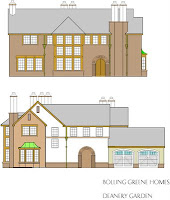
As promised, here are the plans and elevations for the deanery garden knock off I did a couple years ago for Builder/Architect magazine. The rendering is posted over on the CORA facebook photo page. It's about 3500 s.f. in this form. I see the els are for a 2 car, while the plan is for a 3 car. I think I doctored it for a proposed spec house 5-6 years ago. Fell thru, so I'm still looking for a client for this one. It's one of my favorite plans. I love the way the main circulation axis relates to the variety of cross axes. The outside-Inside-Outside-inside Entry sequence on the front door axis- and the look over 2nd floor library- first discovered by a glimpse through the great room at the front door, and later experienced again after climbing the stairs and exploring the upper cross axis. The semi enclosed courtyard- the rhythm of chimney stacks- the wood detailing around the great room window array. I don't know, this one just works for me.